One thing that I avoided for several weeks was the purple “Canton Bazaar” banners. They required reverse painting and the symbols and lettering needed to match from one to another as closely as possible. Finally I came up with a solution. First, I applied a wash of light pink. Then, as you can see in this close up of my first layer, I started the Chinese symbols in the shape of a circle, and the English letters in a rectangle. Using my 00 brush, I carefully blocked in the reverse of the letters and symbols. A couple more coats of paint and I was finished with the banners. I am a traditionalist when it comes to watercolors and I never use white paint in any of my paintings. That means “saving the whites” and frequently doing reverse painting. Like most artists, I also never use black paint because it creates dull, flat areas. If I need a black, I mix my own. For this painting I used a combination of Prussian Blue and Sepia to create my blacks.

With the banners and lanterns finished, it was time to complete the foreground. I laid in a bottom layer of yellow on the road, to keep it warm. Then painted several layers of greys and purples for the pavement. If you look back to the original image, you can see that this photo was taken early morning. The sun is just rising to the right of the scene. This caused a great contrast of tones where the sun was hitting the buildings on the left side, and even more noticeably on the pavement, where the sun shone through the side roads.
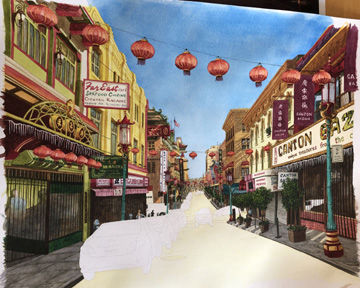
The cars were another thing I was a bit worried about painting. I have never painted or even drawn cars to my recollection. But in reality, it’s no different than anything else you paint. Like I tell my students when they say they can’t draw a horse, or a person, or whatever, you can’t think of the object as a thing. Just think of it in terms of colors, shapes and lines. So I took my own advice and conquered the cars. The reflections on the cars were a puzzle until I identified what they were. That helped a lot in making color choices, so the reflections looked more realistic. The cars were also objects that I changed up from the photo. Four silver cars lined up can be pretty boring, so I played around with the colors of all the cars to create variety. This painting is all about color!

Last few tweaks here and there; checking shadows; repainting the red lanterns more vibrant… and I was done! Here is the final painting. I’m calling it “Canton Bazaar.”


Cindy, this is truly a work of patience. I’m impressed! You captured the scene so exactly, staying true to the colors, but maintaining a painterly feel. Thanks for sharing your work and the steps to complete such a wonderfully complex piece of art. Your daughter, the photographer, must be thrilled!
Warmest wishes, Marian
Sent from my iPad
>
Thank you Marian! It’s always great to hear from other artists.
🖼 Your completed painting is amazing!! It looks warm, fun and exciting. I know that was a huge amount of time to put so much detail. I am happy for you! I am just about done with mine. What a long winter!
Sent from my iPhone
>
Thanks Jill! I can’t wait to see your latest work. 🙂
I enjoyed this so much that I reset my old WordPress account so I could comment. I really enjoyed your write-up of the progression you went through. It helps me appreciate the artwork more. Great job, really enjoyed it, and your painting looks wonderful!
Wow. Thanks so much! I’ve received several comments, texts and emails from these three blog posts – I will definitely have to do this type of thing again. I’m so glad you enjoyed reading my blog and it was great to hear from you Scott!